Forums » Suggestions
Player-nation attendance balancing
I know the title isn't very clear but I couldn't think of anything else that didn't go on for a few lines...anyway on to the suggestion.
I have noticed that since I have started playing, and from what I've heard from other players a long time before that, the attendance of Itani players has been abysmal. At any given moment of the day or week, there are more Serco than UIT/Itani and more UIT than Itani. And even out of these there are 3 UIT bots (Automata, VO-Discord and Faceof) and one Itani bot (SWAPMEET) and no Serco bots afaik. This has created a very unbalanced political situation so to speak.
Now we have an existing system that to some extent attempts to control this. The random nation selector forew players. New players, ie those logging onto the game for the first time, are not offered the nation choice at the beginning and are straight away given a character from a random nation and a random name. I am assuming that the chances of any one nation are equal at 1/3.
I propose that instead of the chances being balanced at 33.3% all the time, they be modified and reevaluated every say 2 months. So 2 months after the system starts, the program pulls out the attendance of players from all three nations and sees (say) that 50% of aggregate game time is from Serco players, 35% from UIT and 15% fr Itani. Here, it tweaks the chances of a new player being assigned to Itani. The chances increase from 33.3% to [33.3+(33.3-15)] which is 51.6%. Serco goes to [33.3+(33.3-50)] which is 16.6% and UIT go to [33.3+(33.3-35)] which is 31.3%. 2 months after this change it reevatuales again, and changes the numbers accordingly.
Another alternative system is to give players the nation choice just from the description, without being exposed to in-game politics. And to write multiple descriptions for the three nations. As the number of player-hours of a particular nation rise, the description becomes progressively more villianous. So if Serco are in an overwhelming majority, the description will portray the Serco in a villianous light, while if Itani are in the majority it will portray Itani as the villians. This will help balance the players out through their choice itself. Obviously a story can be twisted to make anyone the villian without actually changing the basis of the story. Note that I'm not referring to sheer number of players here. I'm referring to player activity, or player-hours.
(Faceof is not a bot? Not sure why it matters what nationality a bot is anyways)
Hwat?
FaceOf sends the same message to 1 at regular intervals. And Faceof is on all the time. Sounds like a bot. And I mentioned the nation to indicate that some of the UIT player's play time is not from actual players, but from bots.
Sounds like a bot.
If you know what sector he is when he logs in, you can chat with him. He is def a player. He also used to post in the forums a while back. He logs off once he sends his channel 1 message.
If you know what sector he is when he logs in, you can chat with him. He is def a player. He also used to post in the forums a while back. He logs off once he sends his channel 1 message.
Ok then Faceof isn't a bot. But we're getting sidetracked here. My point still stands.
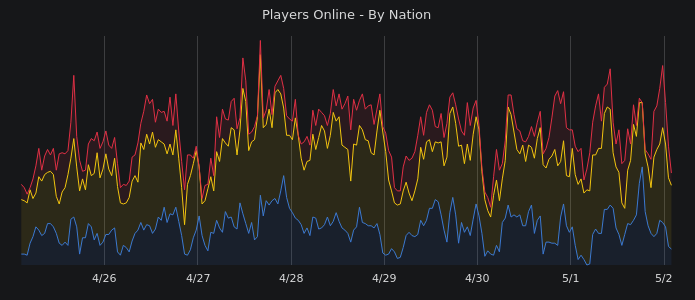
I don't mean to be rude, but according the charts, there are not more Serco than UIT. So i don't see your point.
That's a good point, WAF.
I think sometimes people don't quite understand what a stacked area chart is showing - particularly when there is no scale or data labels (excluded for reasons discussed at length elsewhere). I think a stacked area chart is used in this case to show the trend of users, rather than highlighting the relative players in each nation at the time. It does show that info, but that's not the focus.
It's easy to make the mistake of reading the graph as Serco numbers towering over the others. But the measure is not the relative heights from the "floor" of the graph, but the thickness of each data set relative to the others. We can see right before the 2/5 mark that UIT had way more players that the other 2 nations.
From your explanation it sounds like I misread the graph...I saw that the Serco line was higher than the UIT or Itani line and I've seen multiple Serco on at any given period so I thought that the Serco were in the majority. Usually when I see a line graph I see where the lines are, and that's what lead to the misread.
From what you're saying, ie, from the correct method of interpretation, the Serco players are in fact in the minority. But I still feel that a major contributor in the UIT and Itani graphs are the bots...if you see the thickness of the Itani graph doesn't vary much. This is because SWAPMEET is consistently on. That dip after 2/7 was I think because there was a server restart then, although I may be wrong. Similarly Automata and VO-DISCORD, and to some extent Faceof (even if they aren't a bot a large part of their time seems to be spent AFK) are a major contributor in the thickness of the UIT graph.
And even if the players are atm balanced, my suggestion is directed to ensure that they remain so. An automatic check on how imbalanced the nations' power becomes.
"Relative quantity of total players online, colored by faction. Graphs are updated every 15 minutes, times are in Central Time (UTC -6)."
From the Active Players page. Seems to me like it's a straight up line graph of player attendance by nation. Of course I may be wrong...we need a dev answer here on whether it's a line graph which shows that the Serco are more active than others at any given moment or whether it's as Whistler said and UIT have a huge player attendance compared to Serco and Itani.
From the Active Players page. Seems to me like it's a straight up line graph of player attendance by nation. Of course I may be wrong...we need a dev answer here on whether it's a line graph which shows that the Serco are more active than others at any given moment or whether it's as Whistler said and UIT have a huge player attendance compared to Serco and Itani.
Please look up "stacked area graph" so you can read up on this. If the graph worked as you are considering, wouldn't Serco or UIT hide the Itani graph at some points?
I don't know what a stacked area graph is...I'll read it as per what you described. That way the problem I have described may not exist as yet, but it is a possibility, and my suggestion is a method to avoid that possibility.
You won't even Google it to increase your knowledge?
Consider the example below depicting a (very fake and simplified) player count over time. This is a common graph type in Excel, which I used to make this example. Do you see how the thickness of each item in the series shows the relative number of players in each, but the height off the "floor" represents the overall number or trend? Even though this fake example seems to show UIT towering over the others, the simulated UIT numbers are lower than the others in some cases.

Consider the example below depicting a (very fake and simplified) player count over time. This is a common graph type in Excel, which I used to make this example. Do you see how the thickness of each item in the series shows the relative number of players in each, but the height off the "floor" represents the overall number or trend? Even though this fake example seems to show UIT towering over the others, the simulated UIT numbers are lower than the others in some cases.
Grouped Area Graphs start from the same zero axis, while Stacked Area Graphs have each data series start from the point left by the previous data series.
In other words, take each color and don't consider it's height to the floor of the graph but instead consider it's visible height from the previous color. They are not layered front to back like it appears, they are stacked on top of each other. So as someone mentioned before right around 2/5 you see that the distance from the uit peak to the itani peak is much taller than the itani peak to the floor.. it is also much taller than the height of the serco peak to the UIT peak.
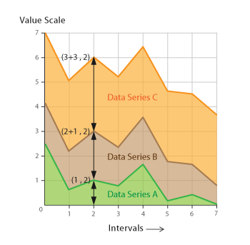
in this example at the location of the black arrow lines, you can see that data series C is about 3 increments wide, while series B is about 2 increments wide, and A is 1 increment wide..
In other words, take each color and don't consider it's height to the floor of the graph but instead consider it's visible height from the previous color. They are not layered front to back like it appears, they are stacked on top of each other. So as someone mentioned before right around 2/5 you see that the distance from the uit peak to the itani peak is much taller than the itani peak to the floor.. it is also much taller than the height of the serco peak to the UIT peak.
in this example at the location of the black arrow lines, you can see that data series C is about 3 increments wide, while series B is about 2 increments wide, and A is 1 increment wide..
Ok...I understand now. But again, sidetracked. The point is that a system such as the one I have described will hopefully prevent the graph of one side getting too thick compared to the others.