Forums » General
We've recently hired our first new employee in many years, I'd like to welcome onboard Curt, aka "Musabi" as he may appear on here (probably not with red text as of yet). Curt's going to be doing some art for us, and one of his first assigned projects has been some factional logos which we intend to use in various ways.
(Curt should not be confused with Brendan, our current intern who is also working on some graphical stuff).
Here are the current prototypes of the factional images. These were conceived as "logos" or "symbols" intended to reflect the given nation, as their conceptual "flag" so to speak. I've worked closely with Curt on many prototypes of each one, leading up to this point, and they all have as many hooks into the game and backstory as we could reasonably make, while still getting an uncomplicated and iconic result that will look interesting over a wide variety of resolutions (ie, cool and detailed at 1024x1024 on a very high resolution screen, but still identifiable at 64x64 in the corner of some menu interface). In all cases, we aimed to work with the traditional colors of the respective nations (Red, Blue, Gold).
They may still change a bit from here, but I think we're far enough along to start to show them to you guys. I think Curt is doing a great job.
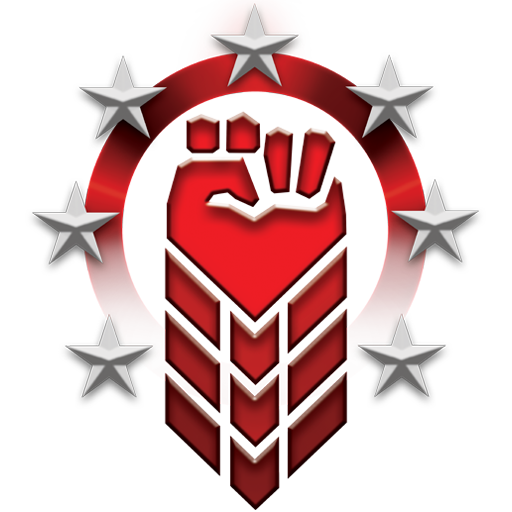
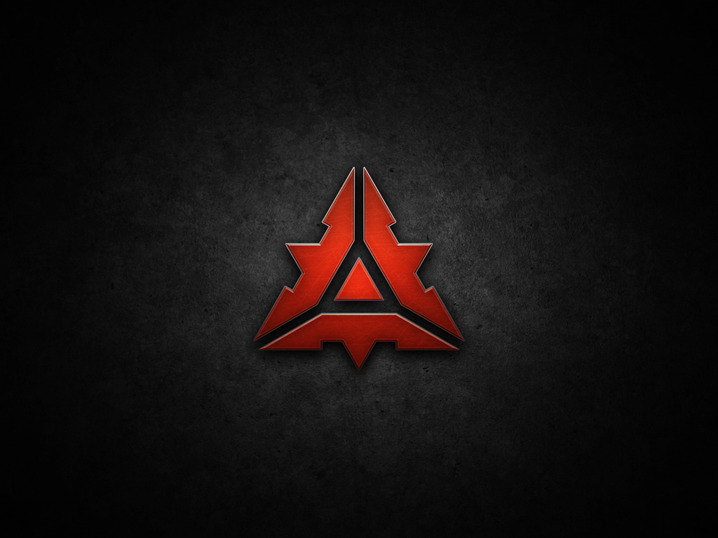
The Serco symbol is intended to emphasize strength, both in terms of military empowerment as well as the overcoming of adversities. The Serco were the most adaptable of the original peoples of Sol II, through their willingness to augment themselves and create new life suited to the rigors of their environment. The chevrons are a cue to the technology of augmentation, while the stars stand for each for the systems within the Dominion.

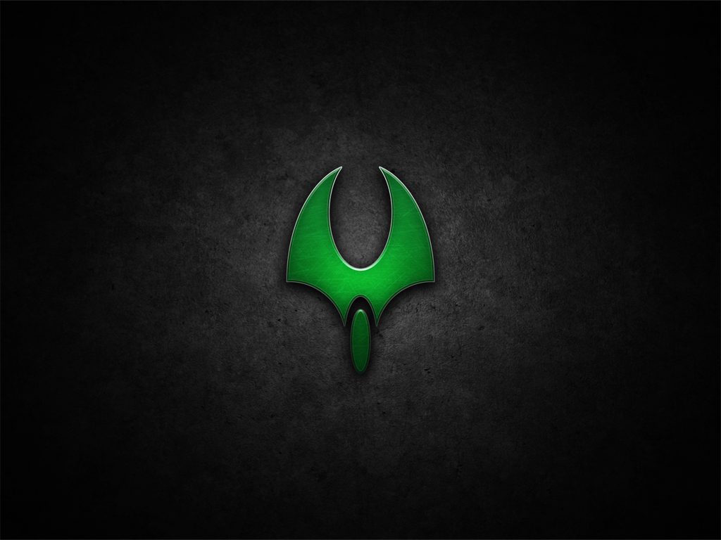
Elements of the Itani symbol include the shield, noting their defensive posture, the wreaths recalling the desire of Eo that they remain a peaceful people. The star within the wormhole recalls their period of exile and wandering, both in leaving Sol II and in their eventual discovery of Itan.
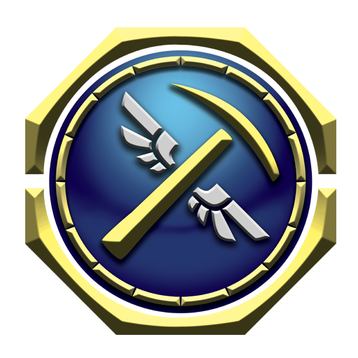
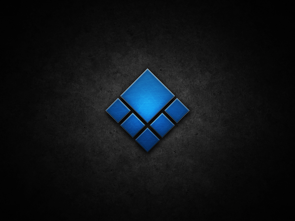
The winged pick of the UIT marks them as creators and builders, while the graduated circle remembers their history as explorers. Of all the three nations, the UIT were always the most culturally oriented towards exploration of the unknown. Beyond this, they are the only people without a home planet as their capitol, instead being adaptable enough to carve out lives for themselves among the stars; gathering what they needed and connecting stations to build any floating metropolis they required.
---
Feedback is welcome, but Be Nice like the sign says.
(Curt should not be confused with Brendan, our current intern who is also working on some graphical stuff).
Here are the current prototypes of the factional images. These were conceived as "logos" or "symbols" intended to reflect the given nation, as their conceptual "flag" so to speak. I've worked closely with Curt on many prototypes of each one, leading up to this point, and they all have as many hooks into the game and backstory as we could reasonably make, while still getting an uncomplicated and iconic result that will look interesting over a wide variety of resolutions (ie, cool and detailed at 1024x1024 on a very high resolution screen, but still identifiable at 64x64 in the corner of some menu interface). In all cases, we aimed to work with the traditional colors of the respective nations (Red, Blue, Gold).
They may still change a bit from here, but I think we're far enough along to start to show them to you guys. I think Curt is doing a great job.
The Serco symbol is intended to emphasize strength, both in terms of military empowerment as well as the overcoming of adversities. The Serco were the most adaptable of the original peoples of Sol II, through their willingness to augment themselves and create new life suited to the rigors of their environment. The chevrons are a cue to the technology of augmentation, while the stars stand for each for the systems within the Dominion.
Elements of the Itani symbol include the shield, noting their defensive posture, the wreaths recalling the desire of Eo that they remain a peaceful people. The star within the wormhole recalls their period of exile and wandering, both in leaving Sol II and in their eventual discovery of Itan.
The winged pick of the UIT marks them as creators and builders, while the graduated circle remembers their history as explorers. Of all the three nations, the UIT were always the most culturally oriented towards exploration of the unknown. Beyond this, they are the only people without a home planet as their capitol, instead being adaptable enough to carve out lives for themselves among the stars; gathering what they needed and connecting stations to build any floating metropolis they required.
---
Feedback is welcome, but Be Nice like the sign says.
Those are pretty awesome. I love all of them just as they are.
They look great, and welcome Musabi.
Serco: Fisting.
Itani: An asshole. Kinda goes with the Serco's fisting, actually.
UIT: A flying pickaxe? Seriously? Looks like some kind of retarded caduceus.
You guys need better graphics, not ones that look like they belong on a Wii.
Itani: An asshole. Kinda goes with the Serco's fisting, actually.
UIT: A flying pickaxe? Seriously? Looks like some kind of retarded caduceus.
You guys need better graphics, not ones that look like they belong on a Wii.
I always thought it was silly that the factions didn't have logos or flags...
Welcome aboard, Musabi. Don't mind Dr. Lecter, he's just got a fist up his ass.
Welcome aboard, Musabi. Don't mind Dr. Lecter, he's just got a fist up his ass.
Awesome! Welcome to the team, Musabi.
Sweet. I like the Itani and Serco ones. I'm not quite feeling the UIT one. The blue thing doesn't really say "explorer" to me at all. Maybe if it had a galaxy sort of ghosted inside or something. Not sure that would work with the pick in front though. I do like the winged-tool concept, keep that.
The chunks of gold around the border make it look kind of like a compass. I'd suggest running with that if you want to convey explorer. Put some roughly triangular pieces at the eight compass points to boost that impression (think Stargate or wristwatch). Then maybe have degree lines draw around the edges of the blue within the ring. Lines might be too much though, could take away from the cleanness.
The chunks of gold around the border make it look kind of like a compass. I'd suggest running with that if you want to convey explorer. Put some roughly triangular pieces at the eight compass points to boost that impression (think Stargate or wristwatch). Then maybe have degree lines draw around the edges of the blue within the ring. Lines might be too much though, could take away from the cleanness.
Welcome Musabi!
Those graphics up there are a pretty awesome start. Although I have to agree with Rin's comment about the UIT one, that's not quite "it" yet. As a former UIT seperatist who's still holding the winged pickaxe proudly I really hope it will have some cosmetic work done. :)
P.S.:lol ARF :D
Those graphics up there are a pretty awesome start. Although I have to agree with Rin's comment about the UIT one, that's not quite "it" yet. As a former UIT seperatist who's still holding the winged pickaxe proudly I really hope it will have some cosmetic work done. :)
P.S.:lol ARF :D
I'll throw in with the others here in saying that the UIT logo seems not quite fully baked, especially viewed side-by-side with the excellent Serco and Itani logos. Not that I am one to judge harshly, when this is my own uninspired imagining of an official logo for my (defunct) UIT nationalist guild.
Anyways, kudos to the new guy.
Anyways, kudos to the new guy.
I like them all, really. The UIT one might be improved slightly with more naturalistic wings, with feathers similar to the Itani leaves. I think that would be more in keeping with a crest, and somehow suggesting greater freedom. While I respect Pizzasgood's specific feedback, I argue that his suggested inclusions will rarely be seen at the level of detail we will usually view these in.
very cool, john.
Excellent! I'm glad we have an artist now so things can get prettier!
I like the concepts but I think some of the graphical features on them are a little too dressed up for universal symbols of an organisation or a race. The Itani one especially I think is most problematic in this regard, but I don't like the Itani so I went ahead and did a little remix on the Serco concept instead (lulz).
The main issue I have with it are the floating stars and 3d elements like the bevels (grr bevels!) and the gradient fade. I've done corporate design for a few years now and I always find the best symbology comes from basic vectors without additional image filters. You can still tac on these elements later, but not if they form a core part of your symbology (like the itani's shield pattern).
This is how I'd imagine the Serco symbol would be reproduced for mass printing on a ship:

As you can see above, the shadows and the other elements are removed, I've replaced the gradient fade with a 'grunge-out' as this is what tends to happen to the lighter elements of a ship stamp. Ideally you would slightly grunge the whole thing. I think the grunge is preferable to the fade because it represents age and fortitude over time: "Hail Serco, Dominion of Old" kind of thing.
In my example I haven't done the cut-out properly but I'm not sure if I like it over having the stars somehow separated from the circle. The main thing is we need symbols that are easily replicable in a number of situations which I don't see happening with all these bevels and stuff!
Keep up the good work!
I like the concepts but I think some of the graphical features on them are a little too dressed up for universal symbols of an organisation or a race. The Itani one especially I think is most problematic in this regard, but I don't like the Itani so I went ahead and did a little remix on the Serco concept instead (lulz).
The main issue I have with it are the floating stars and 3d elements like the bevels (grr bevels!) and the gradient fade. I've done corporate design for a few years now and I always find the best symbology comes from basic vectors without additional image filters. You can still tac on these elements later, but not if they form a core part of your symbology (like the itani's shield pattern).
This is how I'd imagine the Serco symbol would be reproduced for mass printing on a ship:
As you can see above, the shadows and the other elements are removed, I've replaced the gradient fade with a 'grunge-out' as this is what tends to happen to the lighter elements of a ship stamp. Ideally you would slightly grunge the whole thing. I think the grunge is preferable to the fade because it represents age and fortitude over time: "Hail Serco, Dominion of Old" kind of thing.
In my example I haven't done the cut-out properly but I'm not sure if I like it over having the stars somehow separated from the circle. The main thing is we need symbols that are easily replicable in a number of situations which I don't see happening with all these bevels and stuff!
Keep up the good work!
LOL, I'm so glad Dr. Lector exists so we can all tell the difference between constructive criticism (everyone else's posts) and non-constructive criticism (dr lectors post).
Hooray!
Hooray!
Is the hammer and sicle look really that appropriate for a trade driven nation?
The serco one is cool,though
The serco one is cool,though
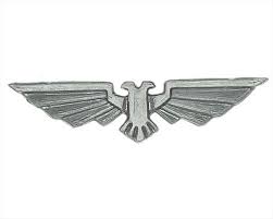
If you're looking for inspiration for winged elements (and even space war symbology in general) you really can't go past the WH40k Universe. Consider:
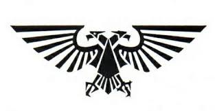
and then in basic print/stamp format for ships and tanks
Also, further to what I said above, having a simple rendition of shapes and then a more complex one is really what you want to be able to do. The factions from Chris Taylor's Supreme Commander have always reminded me of the VO factions sort of mixed around:
UEF (Like a blue UIT)
Cybran (Very similar in story to serco)
Aeon (Kind of like a green Itani)
Now, I'm not suggesting you should copy them or anything, the point is that these designs use all flat vector elements that are completely replicable in 2d, single colour, and then can be represented as seen above with lights, bevels and shadows.
I would like to see the symbols use basic flat vector concepts that don't incorporate rasterized elements in the middle or as a critical function of the symbology (like the itani shield design). I think the Serco one is the closest to what we need to be honest, with the UIT one being adaptable to this.
Hi guys, thanks for the feedback. A couple of quick responses:
- We totally concur that the UIT logo needs something more. That one is undergoing the most ongoing development. The others are probably mostly there. Curt and I discussed that exact subject a few hours before I posted this.
- All the logos were designed from the very beginning to have both "dressed up" photoshop versions, as well as simple color/shape based versions with vector resolution scalability. That influenced the designs and limited the complexity of the logos from the getgo. I intend to use both types in different contexts within the game as well as potentially outside of it. I chose to post the glitzed-up photoshop versions here.
There are a number of schools of thought on this kind of factional-symbol design. Some other (very famous) MMOs use highly graphically complex factional logos, other games use very simplistic and iconic designs. I wanted to land somewhere in the middle; something with enough detail to look interesting under certain specific situations that I foresee, while still able to be simplified down to basic colors/shapes and remain recognizable. Again, the goals and perspectives of various game designers and art directors may differ, this is the path I chose for VO.
Thanks again, and feel free to continue (civil, constructive) feedback.
Fantastic, could you perhaps post some shots of the simple vector versions? I'm interested in how it might look printed on ships.
Welcome Curtis / Musabi!
1st thought (right hemisphere): Sweeeeeeeet!
2nd thought (left hemisphere): Peace!
I like the overall design of the logos, and think they do a great job reflecting the natures of the three nations. These will look good at 64x64 while staying detailed enough to blow up. Good symbolism and iconography.
Congrats, John. Glad to hear Guild Software is growing.
I think the UIT logo should also emphasize trade. Replace the pick-axe with a balance scale, used for weighing gold or silver in trade transactions.
Balance scales are a lot more complex looking and much less iconic, which decreases resolution scalability. We did do some prototypes like that. We also did "Compass" prototypes, and kicked around astrolabes and other random navigational concepts.
Also, the UIT is a "trade" driven nation in the same way that Germany is a "trade" driven nation. They make lots of stuff and export it to everyone else. That makes them builders and manufacturers first, before traders.
I'm not really against something more trade-oriented, but our experiments with that line didn't work out super hot. I welcome suggestions of things other than balance scales or stacks of coins.